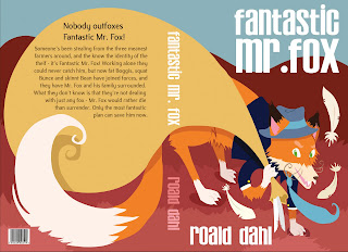
So I found my 'Fantastic Mr. Fox' piece pinterest'd and had no idea people still stumbled upon this!
If you're interested in more of my work I now have a tumblr! I update it with my art now, and probably won't use this blogger app anymore. Check it out here :
------->>> http://tscolley.tumblr.com/
And hey, thanks! You can also reach me by email --- > taramaimone12@gmail.com
Thursday, May 8, 2014
Tuesday, May 18, 2010
Interview!
I did an interview with Burlington County Courier Times about winning 3rd place in the Elys! Check it out:
http://www.phillyburbs.com/news/news_details/article/26/2010/may/17/art-student-hits-the-mark.html
=)
http://www.phillyburbs.com/news/news_details/article/26/2010/may/17/art-student-hits-the-mark.html
=)
Friday, May 7, 2010
Such a slacker on updating!
So I placed 3rd in the 'William H. Ely Exhibition'! I was soo surprised and excited.
1st place winner was Jimmy Tierney, whose work gets more and more amazing all the time. He does a lot of really fantastic book covers and is a great designer.
2cd place winner was Kei Tawara, who has some really nice digital concept art.
And the other 3rd place winner was Dillon Shea, who was a big surprise but has some very interesting digital work.
There were also honorable mentions for : Elizabeth Hallman, April Read, Jet Landis and Sean Talamini.
I also wanted to plug Jess Adamentz because of the kind words she wrote about me on her blog. Her work is really fantastic and she's such a great painter. Her work is always very whimsical and fun.
Anyway! I have been doing fun fun revisions and here they are. Revisions always make things look better. = )


Thursday, April 8, 2010
Fantastic Mr. Fox
Tuesday, April 6, 2010
Ely Poster
Monday, April 5, 2010
Elys!
Monday, November 23, 2009
Halloween Monster!
Subscribe to:
Comments (Atom)


